Zones enablement portal redesign
What is Zones?
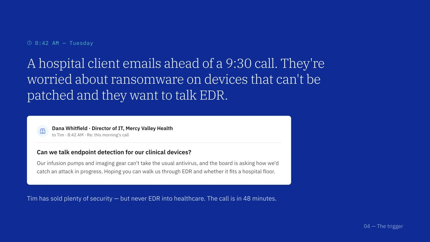
Zones is a global IT solutions provider operating in over 100 countries. Through IBM's Integrated Multivendor Services (IMS), IBM and Zones partnered to bring stronger security solutions to a notoriously under-resourced buyer: small and mid-tier hospitals.
The catch was that a great solution only matters if the person selling it understands it. Zones' sellers had no central place to learn the security technologies they were being asked to recommend, and no way to check whether that knowledge had actually stuck. This was my first project as a designer at IBM and the place I first learned how much of product design happens before anyone draws a screen.
The challenge
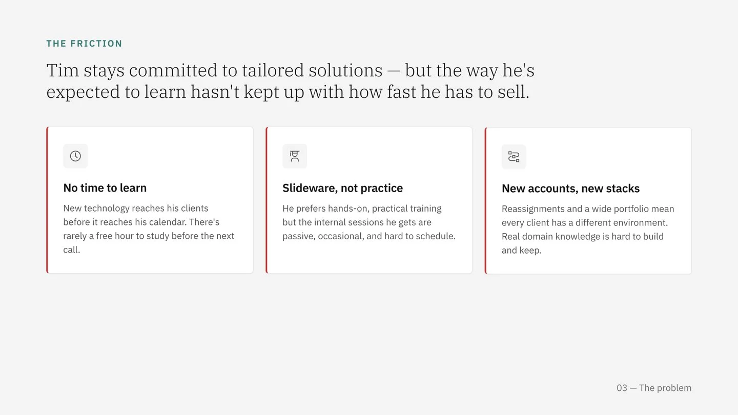
Zones sellers were expected to advise hospitals on security technologies they hadn't been given the time or tools to learn. There was no central platform to study from, and no mechanism to validate understanding before that knowledge reached a client.
The stakes weren't abstract. When a seller guides a hospital's security decision, the downstream effect lands on doctors and patients. Getting the seller confident and correct was, in a real sense, a patient-safety problem wearing an enablement costume.
The reframed problem I designed against: How might we help busy sellers learn security technologies in the gaps of their day and feel genuinely ready to advise a hospital without adding to their cognitive load?
A note on scope
The original portal was designed, shipped, and validated with Zones sellers. The redesign in the second half of this case study is a self-initiated exploration I undertook to revisit my first IBM project with everything I've learned since. I've kept the two clearly separated.
Persona

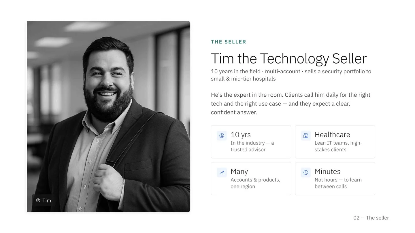
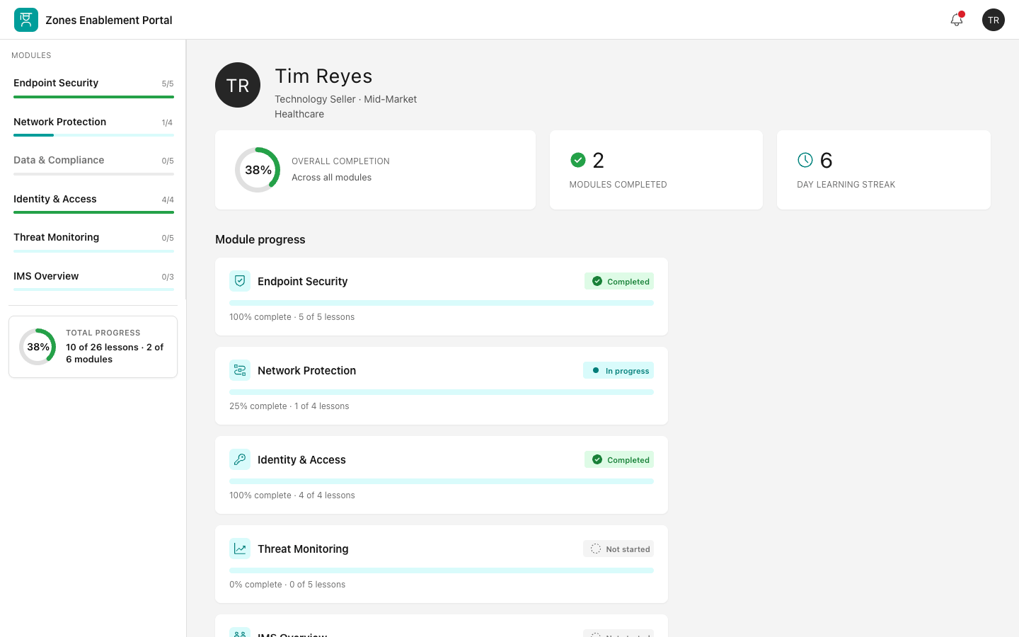
Tim the Technology Seller
Tim has 10 years of experience in the industry and is quite the expert. He interacts with numerous clients daily and handles multiple accounts and is responsible for selling a portfolio of products in a specific geographic region. Tim recommends tech options and use cases that meet his clients' needs.
However, he struggles with limited time to learn new technology before it becomes available to clients. He also prefers hands-on internal training but finds he lacks sufficient opportunities. Additionally, Tim faces difficulty keeping up with the unique environments and team structures of so many clients.
The frequent reassignment of IBM Tech Sellers complicates this further, making it challenging for Tim to develop real domain knowledge. He needs more time and resources for learning new technologies, practical and interactive internal training sessions, and better client management tools to track and understand client environments.
Despite these challenges, Tim remains committed to providing tailored tech solutions to his clients.
Tim’s pain points
Tim struggles with limited time to learn new technology before it reaches clients and prefers hands-on training, which he finds lacking.
Tim also finds it difficult to keep up with the unique environments and team structures of many clients.
Frequent reassignment of IBM Tech Sellers further complicates his ability to develop domain knowledge.
Tim needs more time and resources for learning new technologies, interactive training sessions, and better client management tools.
Hill
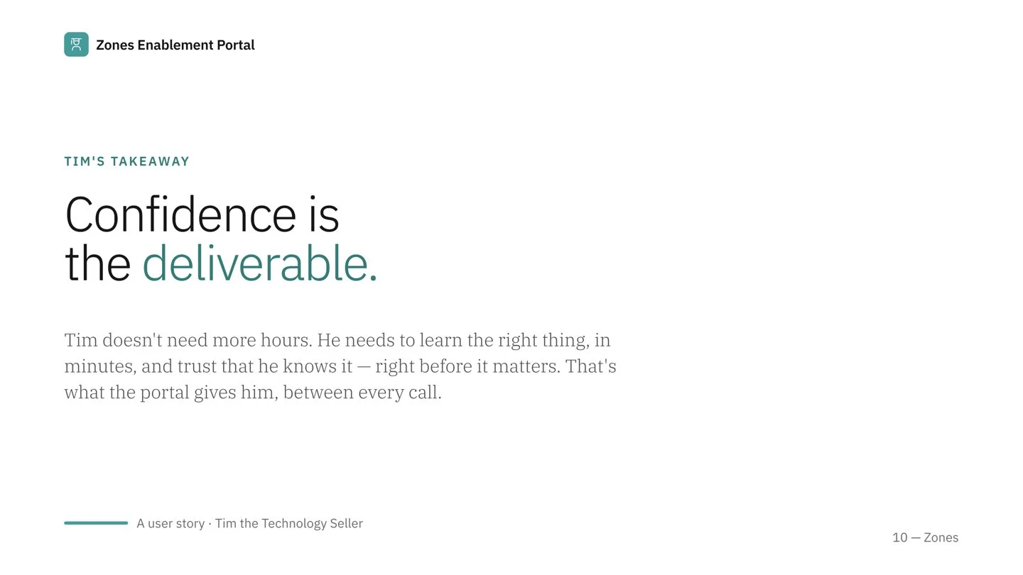
Tim will have a centralized, easy-to-navigate portal that equips him to confidently sell security technologies to small and mid-tier hospitals, improving client relationships and supporting informed decisions.

How I worked & what shipped

“…having 40+ years at IBM, what they have delivered is one of the best, if not the best, piece of work I’ve seen… It is more than a portal, it truly is a sales tool.”
How I worked
I started where I should have with the people. I ran a series of interviews with Zones sellers to map the "as-is" experience, basically their workflow, their frustrations, the moments they felt exposed in front of a client. Those conversations became the foundation for every decision that followed, and they're the reason the product solved the sellers' real problem rather than the one I assumed they had.
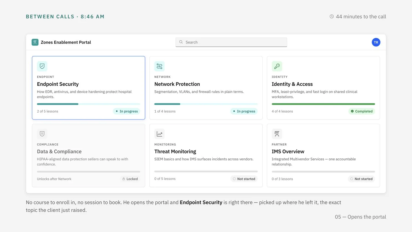
From that research, an educational portal emerged ,built as a Minimal Delightful Experience (MDE). Essentially, focused, lightweight, and shaped around the few things that mattered most.
What shipped
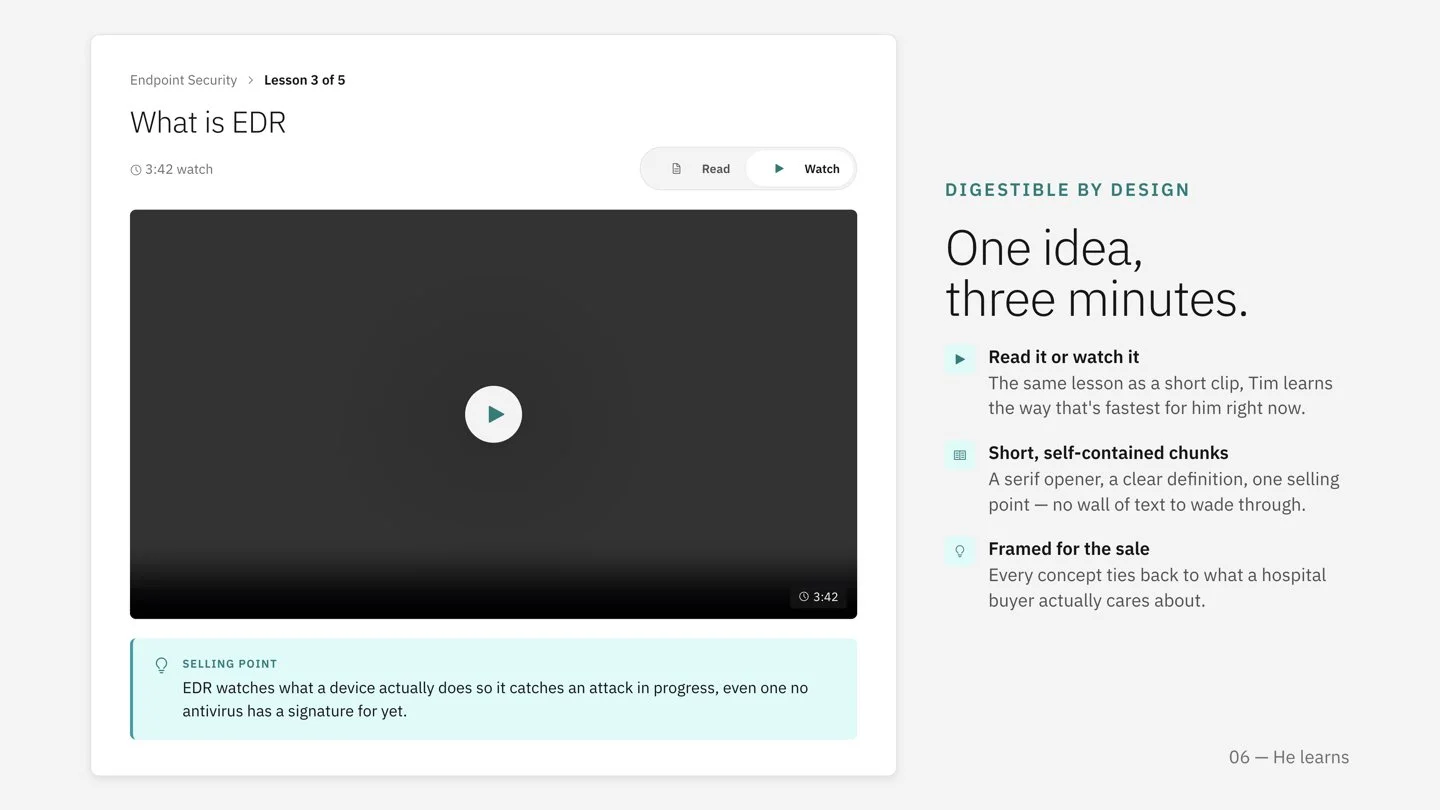
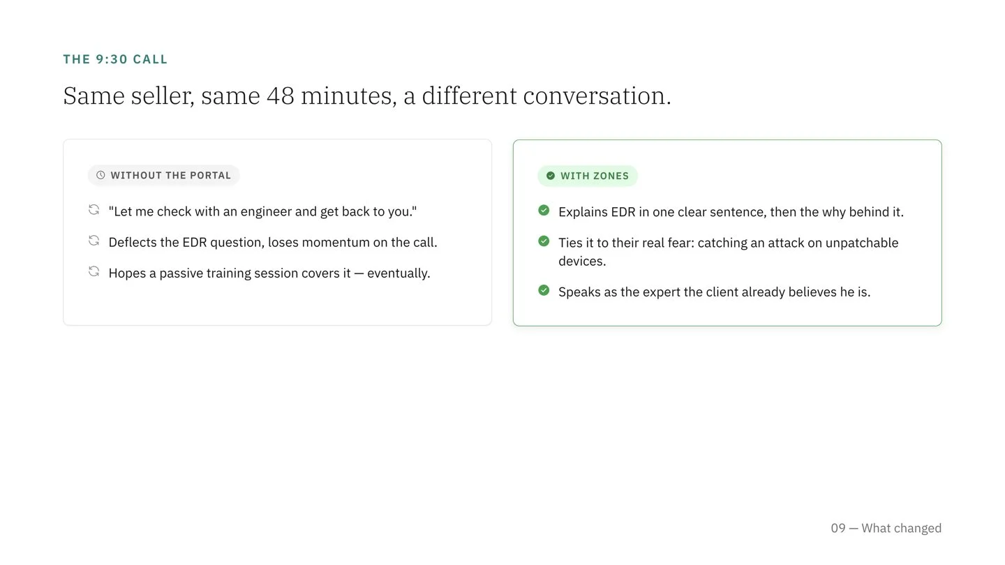
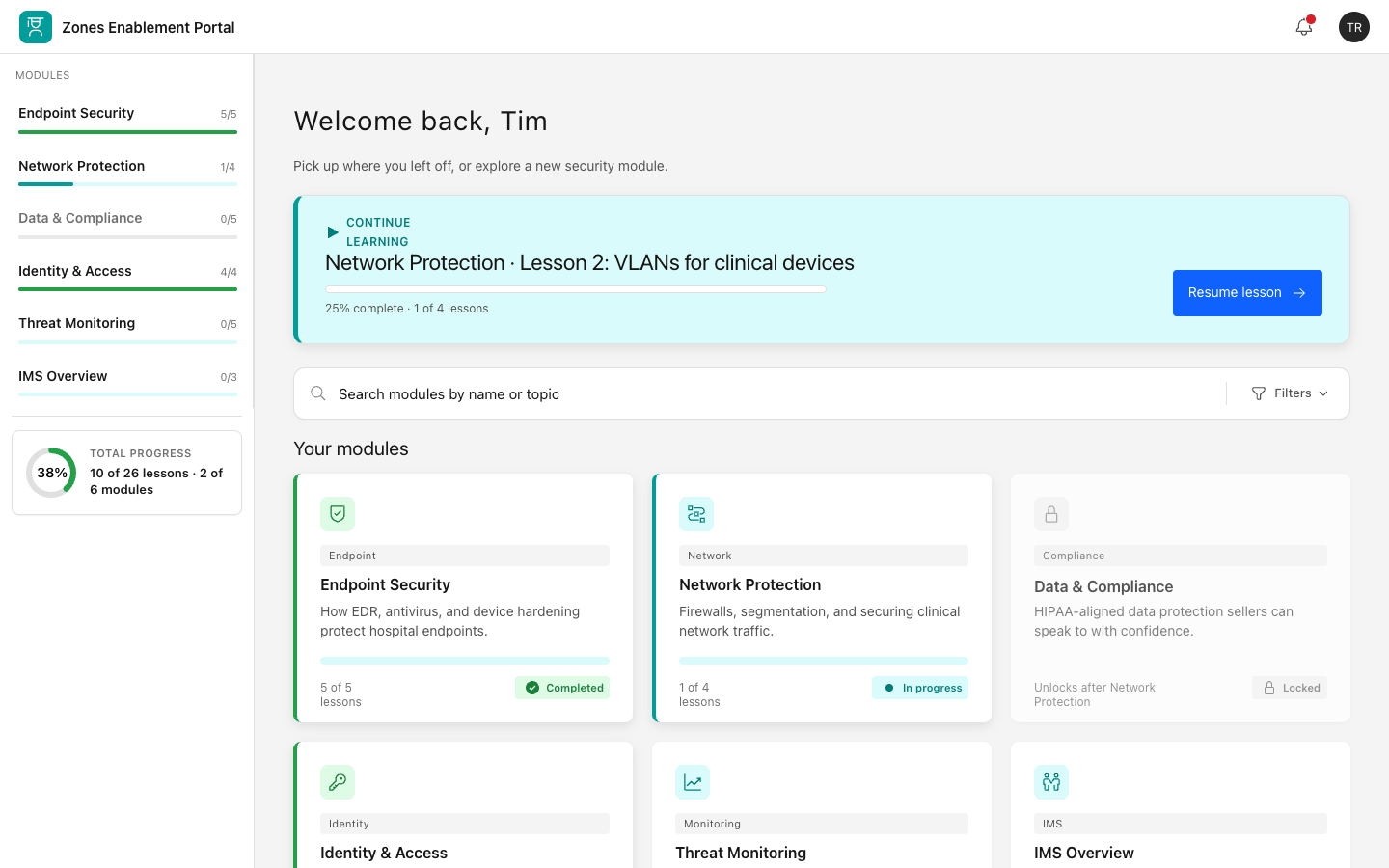
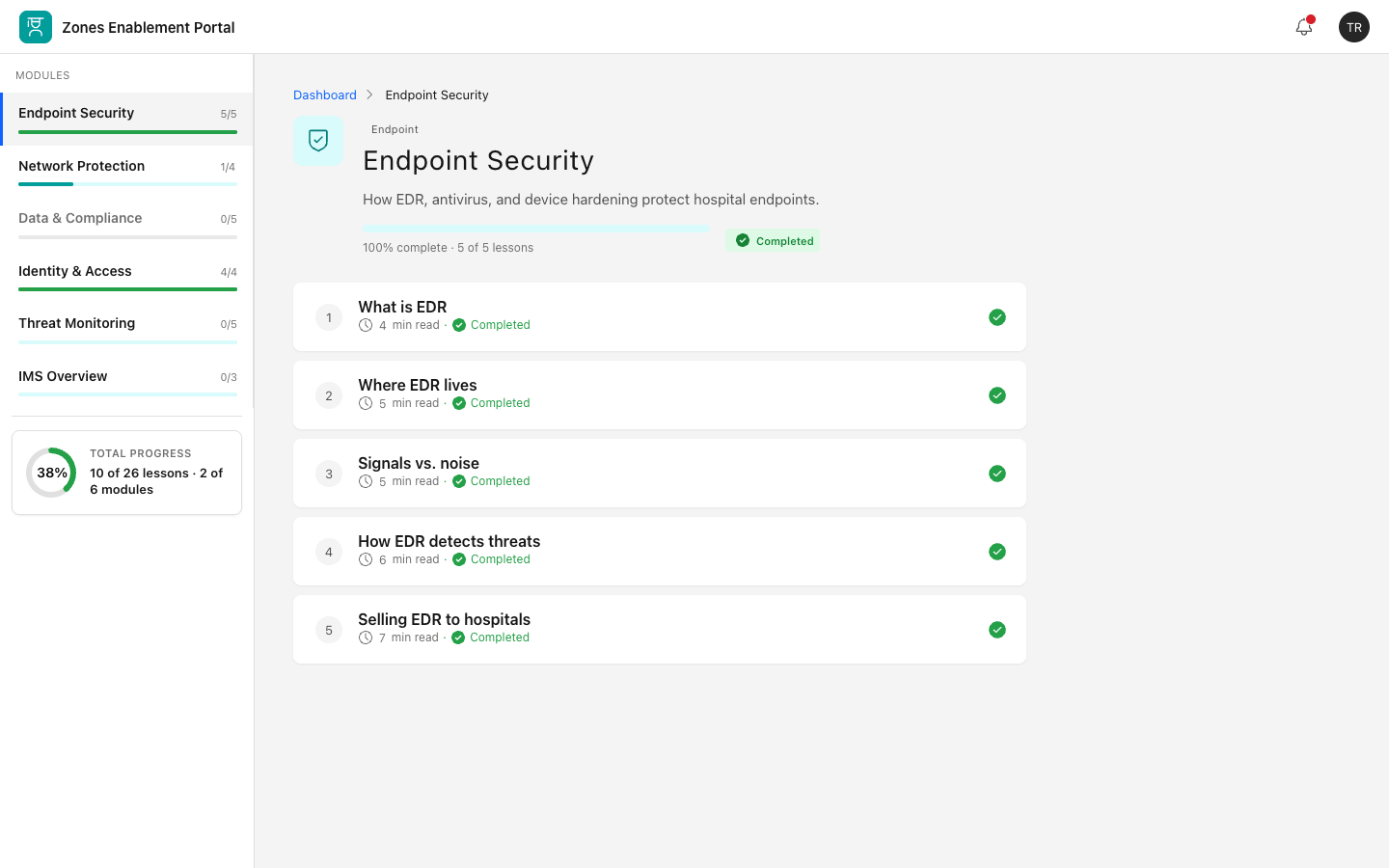
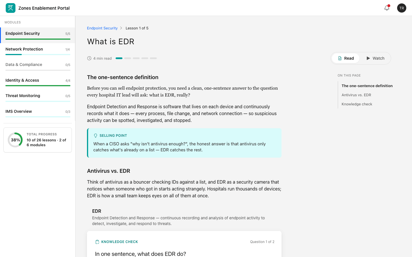
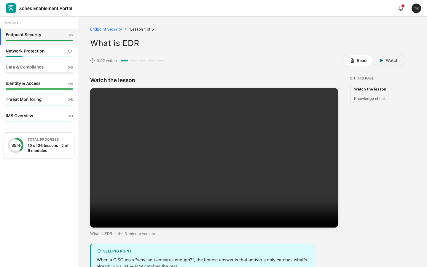
Modular lessons on security technologies and protocols, deliberately broken into digestible chunks rather than long documents.
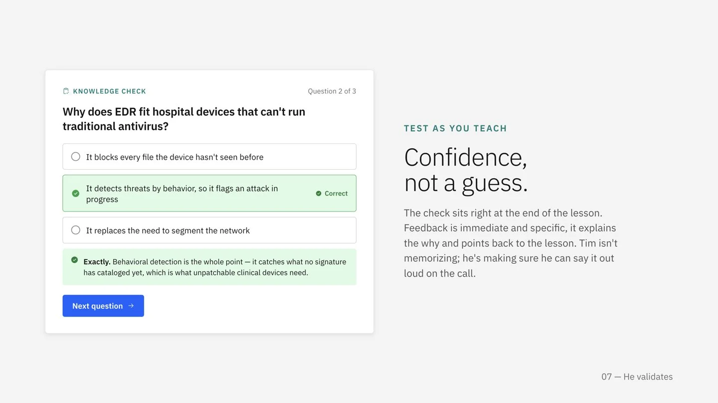
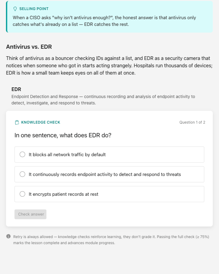
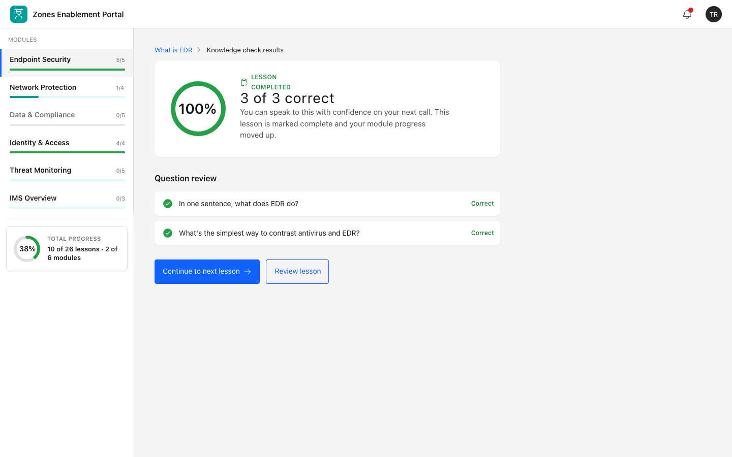
Inline knowledge checks at the end of each page or lesson, so sellers could *test and reinforce* understanding instead of passively reading.
An iterative loop the portal was continuously tested and updated with direct feedback from the sellers themselves.
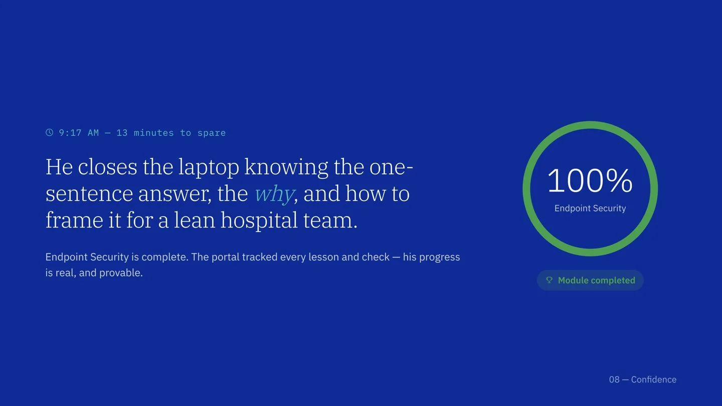
The outcome was a reception which was strongly positive, and a Zones seller specifically noted how consumable the chunked content was. IBM leadership's response told me the work had cleared a higher bar than "useful internal tool”.
That last line reframed how I understood the project, which was that I hadn't built a training site, I'd built a tool that changed how sellers showed up in front of clients
Click image to enlarge.
Click image to enlarge.
Revisiting it: the redesign
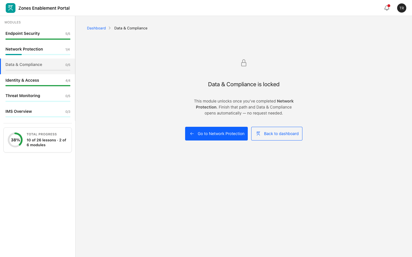
Returning to my first IBM project after growing as a product designer, I could see both what held up and what I'd outgrown. The content strategy and research were sound. What was missing was systems thinking the original was a set of well-designed screens; it wasn't yet a system, so I redesigned it as one.
I set out to evolve the portal on top of IBM's Carbon Design System, staying unmistakably in the IBM family while giving a learning product its own identity. The discipline I cared about here wasn't novelty; it was knowing exactly what to keep, what to bend, and being able to defend every choice.
I built a token-based system, color, type, spacing, motion, components so the product could scale consistently. The harder, more revealing work was the deliberate evolutions from Carbon, each with a reason:
- Promoted teal to a dedicated "learning/progress" accent. It exists in Carbon's palette but is rarely used in UI; reserving it for progress let IBM blue keep meaning "action," giving the product a recognizable identity without inventing off-brand color.
- Softened corners and added two subtle elevation levels. Carbon defaults to sharp, flat surfaces; a learning product reads as more approachable with gentle radius and cards that lift off the background. (Carbon 11 supports rounded variants, so this stays in-family.)
- Increased body size and density in direct service of the "digestible" principle and real readability.
I documented all of this as a parity map, pure Carbon vs. deliberate evolution, so the system is honest about where it departs from the standard and why. Knowing the rules well enough to break them precisely is the part of this I'm proudest of.
Tim’s story — With the redesigned Zones enablement portal
Knowledge checks, accessibility, & words as design material
Knowledge checks
I concentrated the product's personality in one place, the knowledge-check quizzes and the progression system. The check gives immediate correct/incorrect states and feedback that explains why and points back to the relevant lesson chunk. The module progress turn invisible learning into visible confidence. This is the part that makes it "a sales tool, not just a portal."
Accessibility
I treated WCAG 2.1 AA as the floor, not a feature. Visible focus states on every control, all quiz and status meaning carried by color and icon and text (critical given how much green/red the quizzes use), and labeled inputs. Inclusive by default, not retrofitted.
Words as design material
I wrote the interface in sentence case with plain, active verbs ("Check answer," "Continue," "Mark complete"), kept an action's name consistent through its whole flow, and made empty and error states give direction instead of apology.
Zones, redesigned
Click an image to enlarge it.

(Prototype has placeholder images for video.)
How I’ve grown as a product designer
This project sat at both ends of a line I can now see clearly. Then, my instincts were already right where it counted: talk to users first, design for the real problem, ship something focused, iterate with feedback. That foundation is why the original succeeded.
Now, I think in systems before screens, I make principle-driven trade-offs I can defend, I evolve an established design language with intent and restraint rather than decoration, I treat accessibility and content as core design surfaces, and I'm comfortable naming what I haven't yet proven. The first version made a good product. The redesign shows I can make a good system and articulate why every part of it exists.